My drawing journey has gradually become more instinctive, sensitive, atmospheric and through forgetting my inhibition…become expressive, loose and fluid and developing into a style which I am now pursuing and making my own. Alongside learning to draw, recognising proportion I decided to investigate/test further line drawing in a series of life drawings.
With Giacometti’s (emancipated and elongated) style in mind – his technique inspires me and I discuss how his materials, methods, themes etc interest me and why separately.
I plan to be more instinctive, loosening up and liven up my drawings more…. using the whole body, not just from the wrist. Using the whole body and it’s energy within and reflect this in my drawing. Using different effects i.e. ink and water, using different materials enlivens the drawing. Letting my eyes loose focus – at odds, disjointed, out of proportion – but real, create interesting truth in the drawing – getting into a state where my brain, hands and eyes coordinate in a new way. Initially it felt overwhelming to improve, re appraising and measure my work therefore I chose Life Drawing. I love the challenge of curves, angles, texture and context. When I draw, I’m only thinking about mark making shapes and spaces. The complexity of a body intrigues me and how you complete the image!
 yolader dorda
I love to draw on a large scale. This probably stems from my craft’s degree. I love the freedom and joy of making a life size sweep of charcoal on paper to capture the line from neck to toe. I’m hands on and try to be exhuberant with marks. Knowing when to stop is an art. I like to use dramatic coloured pastel, conte markers, charcoal and ink.
An artist of particular interest is Amy Ross – whose art is informed by her background in religious studies and by her interest in folklore and mythology. She is drawn to stories, both factual and fantastical, that provide explanations for the phenomena of the natural world. In my most recent work, she uses animal imagery, particularly wolves, to examine experiences that are both personal and global. I am curious about the dichotomy of public persona versus private identity, and of the individual versus the group – or the lone wolf versus the pack. This series of work has been strongly influenced by stories of shape-shifting, wherein people are transformed, voluntarily or not, into animal form.”

http://www.ianmcallister.com/figures.htm

Another influence for me is the playfully energetic figures constructed with colourful Wire Artist Juidt Rita Rabocsky
Themes I like are – Bodily Embrace – is the body integral to the self, or just the body as an instrument. It’s real value depends on what it signifies. (The kiss, Gustav Klimt 1907-8 from meditations on love SWB) Why I chose it? I wish to explore the human figure and how it is used to express self and as an instrument to explore universal human themes of suffering, love, death and redemption. I’m also intersted in ‘liminal space’ -the inbetween space of intimacy of people and experiencing them as a stranger – feeling the losses and feeling the joys.
Which artists have I been researching? Ghada Amer, Giacometti, Anish Kapoor, Leon Kossoff, Agnes Cecile, Egon Schiele and Henry Moore, Elizabeth Frick, Emma Delpech, Modigliani, Evon Sheila, Anselm Kiefer, Mark Cohen ( harmonic or dissonant intersections of people and their environment)…….etc
Life drawing dates as follows 13/4/16 Laura, 7/5/16 Emma, 14/5/16 Neil, 8/6/16 Laura, 18/6/16 Laura, 6 July Male, 16/7/16 Couple, 14/9/16 Laura.
My chosen objective in undertaking this course was to achieve a sound grounding in basic drawing skills. Distance learning has it’s drawbacks, of course, but, if you need to fit learning around other commitments, it is an excellent option. I think that my draftsmanship has improved immensely. The course has also massively broadened my ideas about what drawing can be. I have had a great introduction to art history and found this more interesting than I would ever have imagined. However, I think that the single biggest outcome for me has been acquiring a disciplined approach to producing a coherent body of work. I feel that I can now take an initial idea (or lack of idea) and, through a reasoned process, develop a journey leading to, hopefully, a well thought out destination. I have also been fortunate in having nearby life drawing classes to attend.
Objectives for this final assignment 5:
- be ambitious, fluid and expressive
- work with line, colour and texture
- develop from the techniques used by Giacometti
- produce a piece with rich, interesting lines
- use the technique of obliterating and restating
- reflect a sculptural shape and interesting shadow
I looked back through all my sketches, especially ‘assignment 4’, and did further thumbnail sketches to decide on my composition. I wanted to get dramatic lighting, so I experimented with spot lights etc. This gave me:
- an interesting, offset shadow
- contrasting texture
- perspective of the body
- fluid overlapping lines and highlights
- a centre of interest.
I experimented with media which I could work over again. I settled on charcoal, pastel, biro and Lomo colour pens
13/4/16 Laura


Having prepared a support, I started marking the exterior points of each model, their line of action, rhythm line using charcoal. Then reworking with graphite and pastel medium. I kept drawing in charcoal and pastel, rubbing over, drawing over and getting more texture. I gradually built up the figure with tone allowed the shapes to appear, layering up the lines. Then gave more tone, plus background. Eventually I started to concentrate on details of tone in the body, but when I did, I may have over filled/refined my shape. I nearly obliterated the shapes and sometimes had to start again. I was then careful not to use charcoal too heavily, and to try for an impression rather than detail. Finally I used neo colour and water pens to highlight.
I am pleased with:
- richness of texture
- restrained colour
- three dimensionality of the body
- integration of shapes, proportion and colour
- flow of lines through the drawing.
I am not sure about:
- lack of definition on the body? just not sure about the balance between clarity and texture
- the shadows are not shapely enough
- I tried to make an interesting but very simple composition, but I am not sure it is interesting enough. More chaos and fluidity.
- is the drawn element of the picture too obvious still?
If I was starting again I would work on a bigger scale, be even more fluid with colour and movement.
7/5/16 Emma


14/5/16 Neil – Seeking new creative means of expression as well as honing my technique was the main goal.


8/6/16 and 18/6/16 Laura – I enjoyed developing the images below using pastel, charcoal with my fingers. Then building up with biro. I felt a real, physical connection with the work and the subject. I was able to bring out frustrations with overlapping lines and expression.


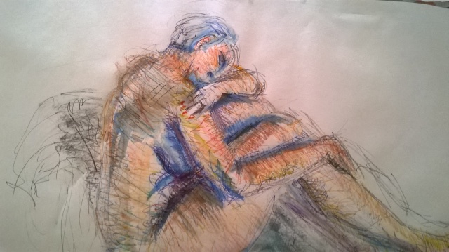
Having committed myself to doing a reclining figure in life class, and the pose having been specially set up for the group, I felt I had to commit to it. I always felt engaged by model and pose – keeping to a similar position. I was really pleased to undertake a variety of poses set out in life classes (CO3 Galleries). I felt I could re-visit my work and create further form and expression. After preparing a large support with tinted paper, I did an initial under drawing in pastel and charcoal, and then merged the whole lot together . Then came the character of the subject creating form and expression with overlapping lines. I wanted to show the figure’s vulnerability.
6 July Male


16/7/16 Couple


A very unique opportunity. In the initial compositional sketches of the couple I liked the one where the bodies are entwined together. Similarly standing – each back arched and the light making them seem as one. With the longer final reclining piece a lamp was introduced to provide a very dramatic/reflective/Degas element. I liked the utter tranquillity and relaxation of this pose and hope I have given it atmosphere.
14/9/16 Laura.
Having done a lot of pieces in charcoal, I wanted to explore media, especially colour. I did some tests of various colour media and colour mixes, and felt that pastel and water colour would be the best approach for subtle colours to reflect the peaceful/gentle pose, and tonal range.
In this final piece I think I have:
- captured a feeling of tranquility and that vulnerability that people have when they are asleep
- added darkness to accentuate a womblike isolation
- allowed the eye to be led into the page
- successfully created a limited palette of warm and cool colours
- integrated the shapes with colour, tone and overlapping line
- the lamp and furniture in the background is just suggested.
- I think I really developed in my use of charcoal as an expressive medium
I am disappointed that:
- the poses could have been more abstract, fluid and intriguing. Proportional accuracy could have been better.
- the quicker poses had more character and movement
- bring out frustrations more
- energy coloured outlines overlapping accuracy drawing fast – but more
- Still a bit stiff – fiddling with detail more fluidity
- More colour and chaos – get bigger!
- Further experimentation with media
Overall, actions – Most enjoyable/exciting: experimenting with sculptural form / mark making / variety of fluid media / research artists / negative space /experimentation with more media and colour line and expression/Vary Figures / prepare backgrounds
- I can’t always intuitively get proportions and placement on the paper accurate
- I didn’t often enough consider at the outset, the overall shape of a pose, and its envelope
- details of fingers and toes still elude me, much more practice is needed
- I found it very difficult in a life class to think in terms of tonal design. With a model surrounded by a ring of easels, I found treatment of the background very difficult. I am aware that this is a great weakness and will be working hard on this in the future, when I can exercise greater control
- I have been mindful of drawing the whole figure, but I would have liked to explore details and cropping in more.
- Having been offered a long, reclining pose so that I could complete an assignment piece….
- I would have liked to explore the use of inks more
- I didn’t use a pencil much because I found charcoal better for working fast and large in a life class
- More time?
- most of my drawings are on loose sheets, not a sketchbook, is there a limit?
- More sculptural forms to create more emotional content.
- In a life class you have no control over the light, pose or background, and only a little control over viewpoint. warm up 5 minute poses, 10 minute poses then 45 mins.
- the impressionistic feel of the broad strokes of colour on the skin
- the blending of the shadows with the form. I would have developed an refined this further with more time
- I really like the marks and tones in the face with the features just suggested
- difficulty choosing assignment pieces
I don’t like:
- the rather dull pose
- the legs can look bulky
- difficulty foreshortening
- rather crude outlining of the figure in places, due to lack of experience and technique with the medium?
- I ran out of time to refine …. have wanted to develop too much detail or tone, which would have brought it forward.
- I didn’t feel I should work further at home. …..
I am quite pleased with this assignment, in that I was striving for expression….. of line and essence of the pose, and I think I have achieved that, although, of course, the accuracy of the draftsmanship could always be better. ……develop the tone on it. I got overly carried away trying to build up the tone in the background on the final drawing. My confidence with the pen grew. …….I like the reclining ones best where my marks were at their most decisive. I have found it difficult to work on a small scale (hence only few sketch books); these are A3 and it worked well for me at that scale. The paper was not really robust enough to take the washes and in the final pose I used heavier paper. …. I found the ink quite difficult on a large scale, and may have got on better with Chinese ink.
Objectives….
- think about structure and essential shapes – not just line
- try some different media, because I got a bit stuck in a rut continuing with the same classes
- try some bold media to stop myself being too fiddly – bigger
I think the warm colours for her flesh work well, and the gravity of her body pushing in to the pillows. Was I too ambitious in this class? but I am pleased I tried different materials, and the pastels worked well. I did manage to stop being too fiddly in a longer pose. My proportions aren’t completely right but I think I have captured the essence of the very foreshortened pose.
Going to a life class with professional models is great compared to trying to press the family into modelling. Posing is a real skill and my drawing helps reflect some lovely poses. Aims:
- be decisive with my marks
- identify the middle of the form and work out
- be conscious of a tonal design
- capture the strong highlights on face and back, and deep shadows cast by arms and hand onto the legs
- not be afraid of hands and feet
It is interesting how much one warms up and tunes in.
I found capturing the complex shadows on her arms and legs difficult, whilst still making sense of the overlapping shapes. I have struggled with the complex highlights and shadows on her face. ……. I identified the centre of the mass and worked outwards, measuring the relative sizes and angles with my pen at arm’s length. I drew fine lines for the broad outline and major shapes. These have mainly been lost in the subsequent detail but are easily seen around the head.
Going over – Laura – concentrating on the shapes of the back, and tonal design, using washable felt tip. I’m not sure this works well as a design – if I’ve created enough abstraction.
I have really grappled with certain aspects of perspective, depth and precision in this part of the course. I understand the principles of creating depth through diminishing detail and tone, increasingly cooler colours etc, but how does one balance this against drawing the eye to the centre of interest and balancing a composition? Often the centre of interest is in the middle distance and framed by the foreground, such as a view through a doorway. It may even be in the far distance, such as the setting sun. It has been a good experience in experimenting with human form, combining, investigating, looking at, using mixed media in a series of life drawings, using…..etc.
I shouldn’t underestimate the extent to which I have already invested in the process that must surely succeed eventually. Things may not happen as quickly as I want – but if I remain patient and persistent, all will move in the right direction. Stand up for my beliefs and importantly – self esteem.
Symbiosis of nature and figures


 Art Cafe – Paris
Further research:

Korean artist Yong Won Song creates life-size thread and wire sculptures that look like scribbled drawings come to life. Somewhere between a dream and a nightmare, fantasy and reality, the artist’s pieces


Antony Gormley, Feeling Material XIV
Figures without faces – Semeon Agroskin who focus’ on body language to convey feelings and emotions.
http://agroskin-art.com/en/galery/index.php?SECTION_ID=26


Torso 1996 year –Cаnvas,oil
http://www.mademistakes.com – work on ipad Michael Rose

Useful quotes:
‘Reclaim your mind and get it out of the hands of the cultural engineers who want to turn you into a half-baked moron consuming all this trash that’s being manufactured out of the bones of a dying world’ Terence McKenna.
‘Portraits have to make an impact at a glance but also repay close examination, so that even art at a hundredth look they’re inexhaustible (Blake Morrison)
‘Portraits – especially painted portraits – are essential to any biography – they are the beginning.’ Margaret Forster
| Title: | Endless Road |
|---|---|
| Notes: | “There aren’t any ordinary people in the world; everyone is extraordinary because everyone has been created by God, and is someone to reverence.” Servant of God, Catherine Doherty, 20th century, from wordofgodeveryday.com |
| Date: | 1971 |
| Artist: | Hofheinz-Doring, Margret, 1910-1994 |
Bibliography
The Nude a new perspective – Gill Saunders
Intimate Distance – Rosemary Betterton
Leon Kossoff/Leon Kossoff and Klaus Kerless. 30130116094409
Anish Kappoor / Germano Celant. 30130087353990
Egon Schiele, 1890-1918: desire and decay/ Wolfgang Georg Fischer. 30130150796760
Behind the mirror; Miro, Calder, Giacometti, Braque / Nicholas Watkins. 30130161370217
Leon Kossoff / Paul Moorhouse. 30130080064685
Anish Kapoor Drawings: Kapoor, Anish. 1954-30130153926513
Alberto Giacomett / Lamarche-Vadel, Bernard. /translated by Kit Currie. 30130086009346
The voices of Masada/ David Kossoff. 30130091101666
Looking at Giacometti by David Sylvester. 30130072284028
Anish Kapoor/ with essays by Homi K. Bhabha and Pier Luigi Tazzi 30130092449213
Alberto Giacometti, 1901-1966 / Toni Stooss and Patrick Elliott. 30130080067472
Anish Kapoor /Donna De Salvo. 30130129978150
From London ; Bacon, Freud, Kossoff, Andrews, Auerbach, Kitaj. 30130080062424
Drawn to painting: Leon Kossoff drawings and prints after Nicolas Poussin. Kendall, Richard. 30130110796587
Alberto Giacometti / Christian Klemm with C. Lanchner, T Bezzola, A Umland. 30130119191830
Alberto Giacometti: sculpture, paintings, drawings / edited by Angela Scheider with contributions by Lucius Grisebach..et al 30130069304094
Egon Schiele: drawings and watercolours / Jane Kallir. 30130126404184
Giacometti’s Paris: lithographs from Alberto Giacometti’s Paris sans fin published in 1969. 30130504574973
Alberto Giacometti: the artist’s studio / edited by Lewos Biggs. 30130123348996
Spectacular bodies. 30130114660789
Alberto Giacometti/ photographed by Herbert Matter; text by Mercedes Matter 30130503758784
Further ideas from http://www.emmadelpech.com everything’s a canvas.
Drawing Projects, An Exploration of the Language of Drawing, Maslen and Southern, Black Dog Publishing, London, 2011
