Understanding Colour – Mixing greys then colour mixing A2
I tried to mix the colours from Chevreul’s wheel beginning with primary red, red-orange, orange yellow and so on. I worked on the colours I was unsure about several times on a sheet of grey prepared paper but the ones I was confident about I applied directly from the palette.


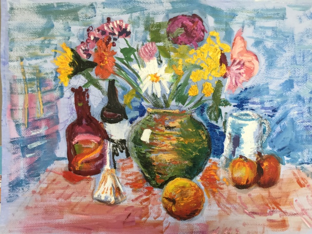
Project – Still life – Drawing in Paint – Still life with flowers – in oils A2
Still life with natural objects – in oils A2
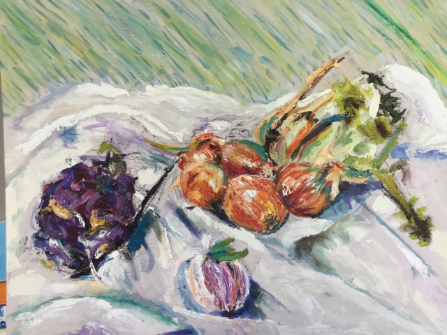
Explored shape and colour and texture of onions – getting lost in the detail. Growing in confidence in mark and colour.
Still life with man-made objects – in oils A2


Not having used oils I became increasing frustrated by their slow drying time. I struggled to stay on track. Experimenting with colour and texture as I progressed.
Exploring colour relationships and contrasts – I made notes about colours and their effects on each other. Research….


Harry – colour feeling – complementary colours to evoke mood…..going back to acrylics which feel more comfortable various – 24×30″.


Other work – portrait and exterior study


Assignment 2 ‘Loosely painted flowers’
Summary – my preferred subject for still life is flowers. My preferred medium is acrylics. Working in a free and expressive style, no labouring over detail. I chose to work with floral displays and from photos. I will be working in acrylics after oils became far to slow and constraining to work with. I produced a few finished pieces.
Composition approaches – there are many ways to work creatively. It helped to have photo reference to use and flowers but I learned not to follow them slavishly. I practiced compositions on rough paper first – small thumbnail sketches helped. I wanted a loosely painted approach in order to use my natural creativity. I used elements of the photo/flowers e.g. the flower shapes but changed the vase/ colours of flowers, background, or vase or all or some. I could also mix flowers from different photos.


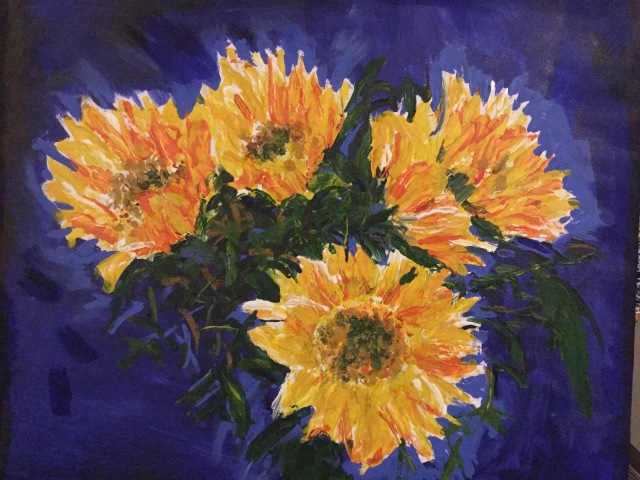
Background Colours – Maximum impact A2 acrylic on canvas
I wanted a vibrant and maximum impact colour therefore used a complementary colour for my flowers i.e. if painting in predominantly yellow – opting for violet or purple light wash in the background.
For a more subtle approach I would choose a neutral background which works well in any painting. But in this case I wanted a big contrast and use my new understanding of colour to greater effect.
Detail – suggestions of detail rather than overloading the viewer with too much.
Painting loosely – adding detail too early is the enemy of achieving a loose painting. I started big and bold, laying down several background colours upon which to set my floral composition. I frequently referred to Van Gogh’s sunflowers in order to experiment with different colour effects, brushstrokes and textures and am very happy with the result.
Research:
The Colour Mixing Bible 2004 Ian Sidaway
The Elements of Colour 1970 Itten
Basic Colour: a practical handbook 2008 Jane de Sausmarez
Vangogh – various
